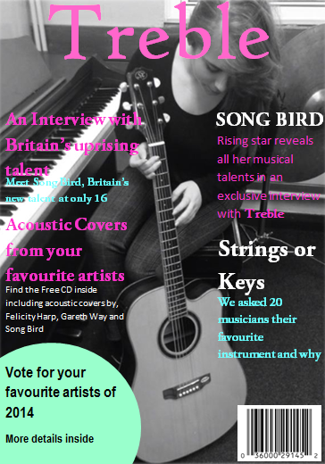
For my media music magazine I decided to do a folk inspired
magazine called ‘Treble’. I originally named this magazine ‘Acoustic’ as it
represents the kind of music folk music is about. After doing some research I
discovered there was already a magazine named ‘Acoustic’ which led me to choose
the name ‘Treble’ as I wanted to link the cover picture to the title and make
it clear it was a music magazine by the title. I used a simple Treble symbol to link in with the name of the magazine and so it can be recognised by the symbol as well as the name. For my cover photo it shows a
young artist ‘Song Bird’ simply looking down on an Acoustic guitar so that all
focus is on the guitar and music and not focused on just the artist, by shaping
the text around the photo it adds more focus on the guitar and the music. I put
the photo in black and white to give it that simplistic folk feel with subtle
colours; I then had to find some colours that could work with the black and
white. I decided to use Pink and Blue as they showed up the best on the dark
background, as well as this both colours also contrast against each other and
by adding some colour to the cover it keeps that simple folk feel with it being
dull and boring. I have a small banner at the top of my magazine to encourage people to enter the website and buy the magazine over others. I feel my cover would be similar to other magazine covers but
would still be able to stand out with the splash of colour to attract people to
it, my magazine is not aimed at a specific range of age but for people that
would enjoy folk music. To attract my audience to the magazine I can link back
to my picture, as the first thing to see would be the Acoustic guitar which
links in with the folk music.

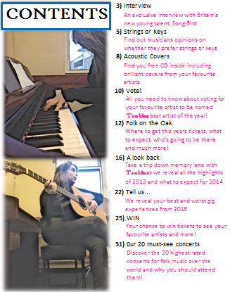
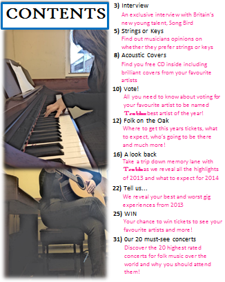
For my contents I have kept the same colour scheme with the
black, white, pink and blue. I have set it out simply as it is not the kind of magazine I wanted to be over the top or 'in your face', I feel the simplicity matches the genre of music well. I have used Song Bird to be in the contents as well to show that another
main focus of the magazine is this new uprising talent and her music. I have
used two pictures showing Song Bird playing an Acoustic Piano and an Acoustic
Guitar giving it an even more musical feel. I have the contents to the right side
of the pictures so when your attention immediately goes to the pictures first
you see the contents written next to it as your eyes will naturally read along to the right. I chose to do it like this as it gave me more room to add more information and more content pages than my previous attempt. I have set the contents out in a
simple rectangle shape so as it is easy to follow and read downwards and is nothing to
extreme so that it does not contradicts with the cover.
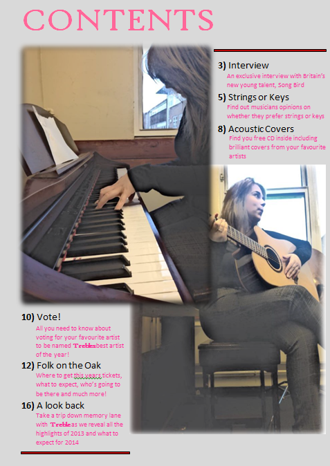
My editorial page carries on with the manuscript background
and colour scheme. By keeping this throughout the magazine it makes the pages
link together well, when starting this magazine I had different colours
throughout and it made the magazine look messy, unprofessional and did not link
at all. The title of my editorial page is a quote from Song Birds interview; I
felt by putting a bold colourful quote as the title it would straight away make
the reader decide whether it seems like an interesting interview to read. I
have three pictures of Song Bird in black and white and as well as the
manuscript background it made the pages look very bland, by adding the pink and
blue splashes of colour all over the page instead of in a certain area it makes
the page less boring and makes it look more inviting to read. Throughout my
magazine I have used the same font except for my title ‘Treble’ which has been
wrote in a different font throughout the magazine as if it is its own logo and
also so people could recognise the magazine just by the title and font.

I believe my media product is similar to most other music
magazines by the way it is set out with a main picture with large and small
text shaped around it, however I believe it challenges other music magazines as
my main picture does not show a famous celebrity posing with no link to any
music, whereas my magazine is stripped back and shows that it is all about the
music with the simple picture of the artist looking at her guitar rather than
the camera. As well as this a lot of other folk magazines can come across as
being boring and bland, I believe with my cover and the splashes of colour,
picture and information it comes across as being simple yet eye-catching and
not boring.
Folk music is usually stereotyped that only older people
listen to it, by having Song Bird on the front as a young folk artist it shows
the variety of people that actually do listen to folk music, with more and more
folk artist becoming bigger and more folk songs becoming popular with all ages
I think having a young artist on my cover represents the kind of social groups
that in fact do listen to folk music. With folk music being a big hit because
of the music and lyrics rather than the celebrity, I think having Song Bird
looking down at the guitar portrays this well.
I believe my folk magazine could be distributed by ‘The
living tradition’ as they specifically sell folk magazines and have a folk
website. I think compared to the other folk magazines mine would be a higher
seller as it is set out differently from other folk magazines, my magazine has
more colour and more information on the cover showing it has a lot to offer.
When creating my magazine I discovered there was a lot of
cropping and shaping involved to make the magazine look neat and in place. I
ensured my background was always covered so there were no unnecessary gaps. I
made two pictures fade into each other in the contents page, this was to add an
effect to the page and make it look more professional and interesting rather than
just having two pictures placed next to each other. I had to find the right
colours to suit the background and the right fonts to make it easy to read and
so it wasn’t a dull black and white throughout. For my editorial page I had to
crop the picture to stay in line with the interview so as it did not look
messy, I also did this for my contents, by shaping and finding the right size
text to shape around the pictures.
By doing my preliminary task previously I have learnt about
shaping the text to fit around pictures so the main focus instantly goes to the
photo and usually from a picture people can judge whether or not it would be a
magazine that they would read. I have learnt about colours and by using the
colour wheel I found colours that can contrast against each other and work well
together, through this I have also learnt about keeping a continuous colour
scheme so as the pages link together and don’t look messy and as if they all
come from different magazines. I learnt how to shape the pictures and text so
as it doesn’t look blocked, which has also enabled me to learn how to make
something look simple and interesting rather than dull. I was not overly happy
with my school magazine as I just thought it looked boring and rushed, I didn’t
think the colours were right and all the pictures were just simple squares with
no colour effects or anything added to them. There was also not enough
information and the fonts did not match. However from doing the school magazine
It has enable me to make a lot of improvement for my music magazine and by
comparing them I could see where improvement was needed.


